This semester, I have the honor of being a teaching assistant for Advanced Undergraduate Statistics. Despite TA’ing for the course, I have never actually taken it myself. I had worked with the instructor (the fantastic Catherine Bain) on prior research, and she figured that I was already knowledgeable enough in the material to help teach it (Oh, if only she knew how inept I actually am).
One of the consequences of her gracious assumption is that there is a lot of material in class that I have attemped to learn through guerrilla tactics, but have not had formal training in. As such, we often cover material in class that fills in some basic gap of knowledge that I hadn’t realized existed.
Other times, we cover material in a more structured manner than I had previously experienced, which is always helpful. Overall, it’s been a great way to more fully immerse myself in basic statistical methodology.
During our last class period, we completed a lab where the students had to work with a dataset and clean it of missing values and outliers. As is common, testing for outliers involved checking the data for normality. For the purposes of undergraduate statistics, this consisted of generating a histogram of the data and visually assessing it.
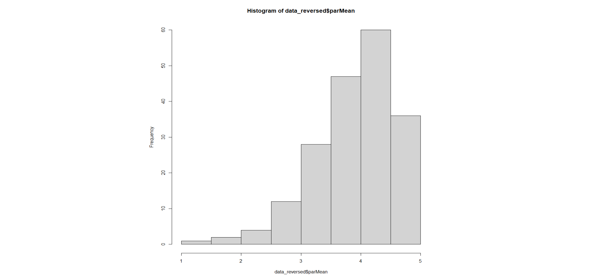
The data were the individual means of a 6-item 5-point scale measuring general parenting behaviors from 1 = coercive parenting to 5 = positive parenting. As we can see, the data seem to have a negative skew. While we discussed it in class, I wanted to introduce some of the students to a more formal way of assessing normality: Quantile-Quantile plots.
Keane’s quick-and-quality Quantile-Quantile plot guide
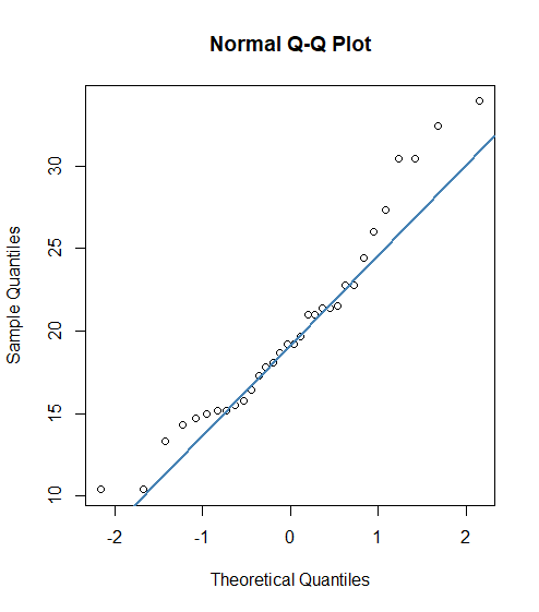
A Quantile-Quantile plot (Q-Q plot, for short) is a relatively quick way to assess the normality of a distribution. A Q-Q plot is a scatterplot which plots two sets of quantiles against each other: theoretical vs. sample.
What is a quantile? Well, a quantile is basically another way to say “percentile.” When you plot quantiles, you are plotting the points at which a certain amount of data fall below (50%, 90%, etc).
A z-score normalizes data by expressing its distance from the mean in terms of standard deviations. When we plot quantiles, we plot them in terms of their z-score. As such, the x-axis of a Q-Q plot often ranges from around -3 to +3, which gives us a range of data of about 3 standard deviations from the mean. The y-axis of a Q-Q plot is often the numerical value of the data.
When we look at a Q-Q plot (shown below), it shows us the expected distribution of quantiles (if our data were normal) plotted against our actual sample of data. If our data were perfectly normal, they would follow the expected distribution perfectly linearly. The blue line on the plot below displays this expected relationship.
From this, we can evaluate any deviation from the expected line to mean that our data deviates from normality. If this is confusing, don’t worry — I’m writing this because it confused me too.
As we can tell from our quick-and-easy Q-Q plot guide, Q-Q plots are useful in assessing the normality of data. Prior to yesterday, this was about the extent of my knowledge of them. However, as I was thinking about them in class, I realized that I didn’t fully understand why we interpreted them the way we do.
For example, by running a Q-Q plot on the data previously observed (in the histogram), we obtain the following plot:
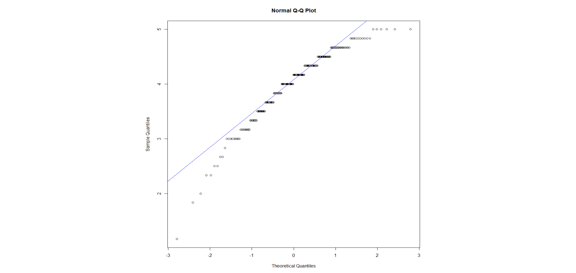
As we can see, our data deviate from the expected distribution. Notably, our scatterplot shows a curve, which (apparently) means that our data are skewed. But, why?
I realized that I had no real knowledge of the theoretical basis for Q-Q plot interpretation. Part of this problem originates from the fact that online materials for learning about Q-Q plots suck. Most online sources do a great job of explaining what a Q-Q plot is, but fail to delve into proper interpretation. For example, this website explains very well what they are, but simply lists the different possibilities for Q-Q plot outcomes. Even UVA (a school I’m applying to) on their website don’t explain why we see differences between curved plots and extremity-deviated plots.
So, I asked Catherine, who ended up being a great help. One key part of intrepreting a Q-Q plot, I realized, is thinking about it in terms of individual data points. Take a closer look at the previous graph:
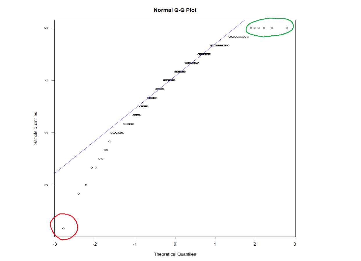
Let’s think about what the data point circled in red is communicating. On the x-axis, we have our theorized z-scores for perfectly normal data. On the y-axis, we can see that the point’s value is around ~1.2. So, what the heck does this mean? Well, we observe that the point is distant from the line. Now consider what the line is telling us: the expected relationship between our data and the normal distribution. So, we can imagine our line extending all the way past the left side of the graph, like so:
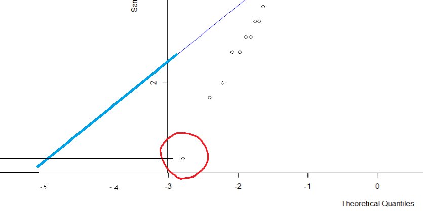
From this, we can see that if our line continued, we would expect to see the value of 1.2 at approximately a z-score of -5. Since our score of 1.2 occurs around a -3 z-score, it appears at a frequency about two standard deviations higher than expected. Thus, it (and all the scores under the curve around it) is observed more than we would expect from a typical normal distribution.
How do we synthesize this with our understanding of normality? Well, this highlights another problem with how normal distributions and skew are communicated. Most diagrams of skewed data vs. normal data that I’ve seen look something like this:
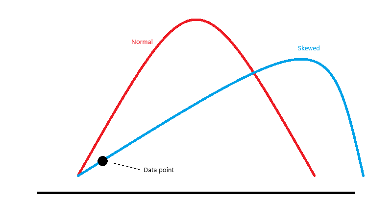
This isn’t wrong per se, but it’s a little misleading. These distributions would no longer be matched on their respective means. For example, consider our previous example. If we take a data point at the extreme end of our negatively-skewed data (highlighted on the plot), we know that it is occurring at a frequency higher than we would expect from a typical normal curve. But wait, this appears inconsistent with the chart of skewed data we just saw! Doesn’t it look like that data point is actually below where it should be on the normal distribution? Doesn’t that mean we are seeing it less than we should?
Thus the problem. I propose conceptualizing skewed data in one of two different ways.
The first way: drawing distributions accurately
I made a slight modification on the previous graph which I think makes all the difference:
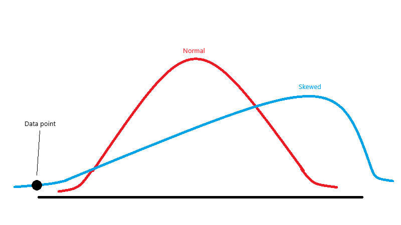
Now, if we think about a data point on the extreme end of the negative skew, we can see that it truly is falling above where we would expect it: something that our initial Q-Q plot was telling us. Most comparisons of skewed vs. normal data don’t show it to this detail, but it’s important to understand that the logistic slope of the left side of a negatively-skewed distribution (and right side of a positively-skewed distribution) decreases at a slower rate than that of a normal curve. To consider the ramifications for the right side of the graph, see the following example.
The second way: thinking about where the deviation from normality originates
Consider the following graph:
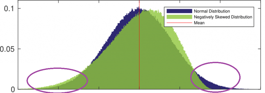
In this graph, we can see a normal distribution compared to a negatively-skewed distribution. On the tail ends of the distributions (the parts we’re concerned with in many of our Q-Q plots), we can see exactly how the data differ from normality. On the left, we see the green (negative skew) sitting higher than the base normal curve. On the right, we can see how it falls below the normal curve: it is occurring less than we would expect.
Final takeaways
That’s mostly it - I hope it’s been helpful. One additional point that needs to be made is that it’s important to remember that what it “means” for data to fall above/below the expected line in a Q-Q plot switches depending on whether the data is to the left or the right of the z-score of 0. When we considered our previous extreme data point, it was below the line on the left, meaning that it had a higher z-score than expected. However, if we consider an extreme data point on the positive end of the z-distribution, the opposite holds true: if a point is below the line, it means that it is more extreme than we would expect. This distinction comes from the fact that a z-score being “lower” means that it’s more extreme when it’s negative, but less extreme when it’s positive. Keep that in mind!
The aforementioned point influences how we can interpret data that is leptokurtic or platykurtic. If our Q-Q plot looks like a squiggly s-shaped curve, it can mean either. We just have to think about the position of our data with regard to the expected line to see which quality of kurtosis the data have.
Also, I do not claim to be an expert on Q-Q plots. I still have much to learn in my academic career. Still, I figured that I’d expound on some of the thoughts I’ve had concerning Q-Q plots these past few days.
Time to go write some grad school application essays.